First some advice
Once the information for a map has been gathered the next step is to produce the map. At this stage a number of cartographic issues need to be addressed. The best advice one can give to novice map makers is to:
- look at as many examples of similar maps as you can
- seek the advice of experienced cartographers
- don't "re–invent the wheel" – use existing symbol and colour standards, and adopt specifications developed by lead agencies
Size
The size at which a map is going to be printed or viewed dictates a number of things, the most important of which is scale. Once the scale has been decided, the level of generalisation can also be determined. In cartography 'generalisation' means "how much detail can be shown on the map face before it gets too busy", or more simply "how cluttered do I want the map to be?"
In this modern world, maps are either printed onto paper or are viewed electronically (e.g. on computer screen). The principals of cartographic composition are essentially the same for both in that they can be photographically/electronically enlarged or reduced but the relationship between text and symbols remains the same. For printed maps, if more, or less, detail is required then a new map needs to be produced or enlargement(s) added to the map. For web/electronic maps it is possible to have a range of views with different scales and detail as one zooms in or out.
Position on the Paper
A map is positioned within the framework of its 'piece of paper'. It is an important part of the map maker’s art to decide how the map will be positioned on the piece of paper. There are no set rules and very few conventions in regard to this process – often referred to as Map Layout.
The map may:
- Occupy the entire 'piece of paper' with the marginalia being included on the face of the map.
- Occupy only a part of the 'piece of paper' with the marginalia occupying the remainder.
- The map face and the marginalia may be completely separate from each other – either as a separate document or printed on the back of the map. This occurs where the marginalia is very complex. However, be warned, where the marginalia is separate to the map there is considerable risk that the map would become unreadable if the two are separated.
Where a map is to be bound into a publication such as an Atlas, the map may be placed off–centre on the page (allowing for paper which may be lost when binding occurs) – this is called a binding edge.
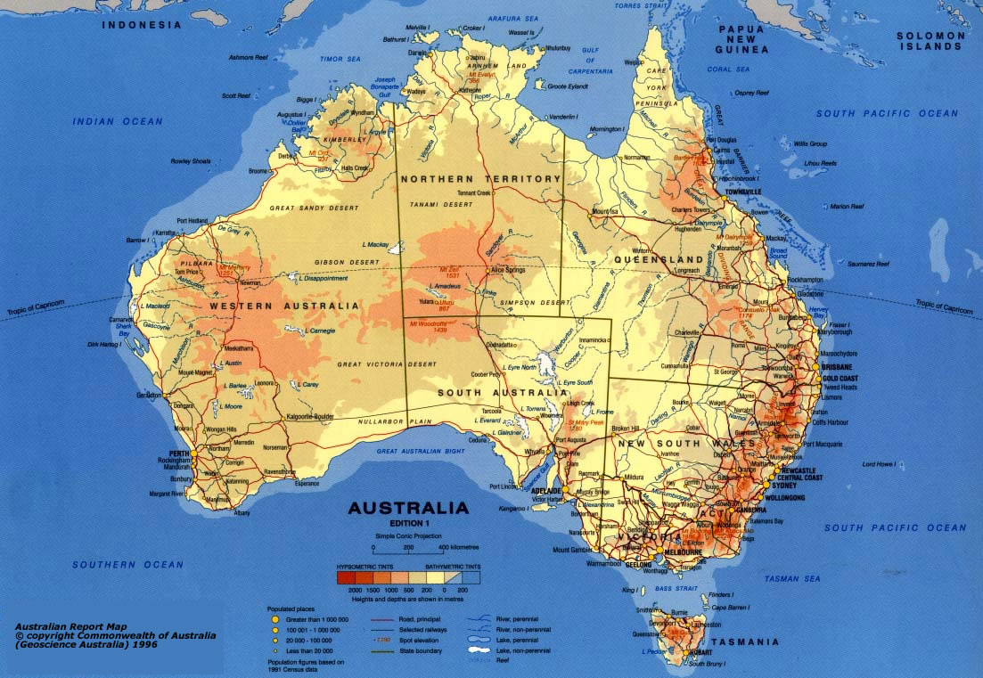
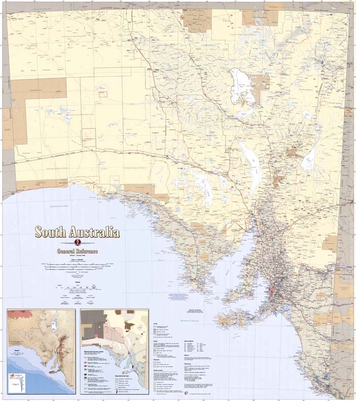
These three maps are good examples of these map layout concepts. The first map is a General Reference map of Australia, where the map occupies the entire 'piece of paper' and the marginalia is included on the face of the map. Note how easy to read this is and how the colours ’draw your eye‘ to the map itself.
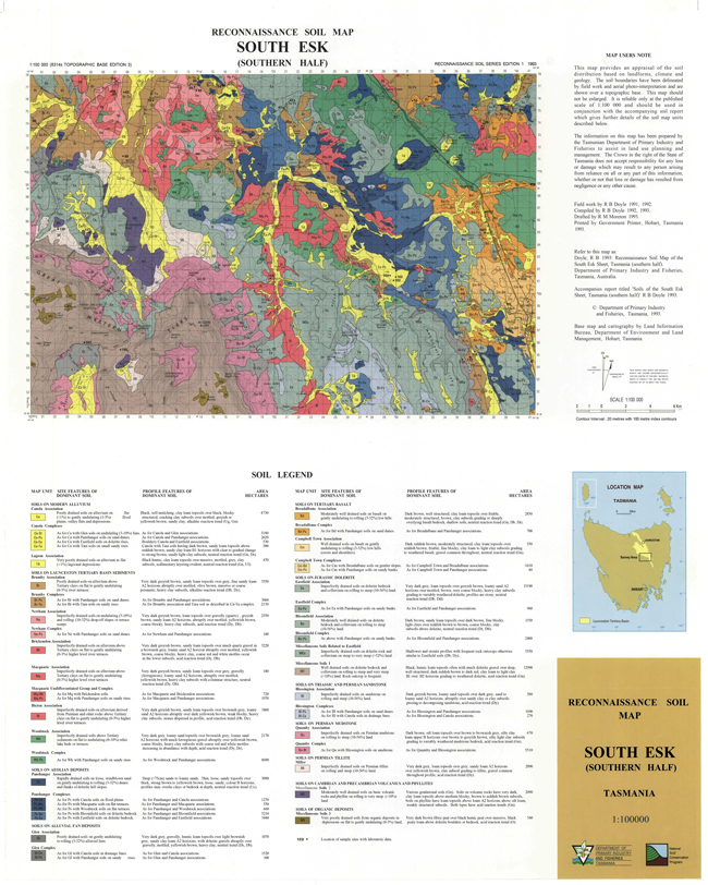
The second map is a more complex map, of soil types in northern Tasmania. Here the marginalia has been placed in a separate panel to the actual map. This option has been used as the map itself is very complex and the legend is also very complex, because it has to explain in detail the information that is being shown. In this example the map maker could easily have decided to print the legend separately or on the back of the map – because it is very complex.
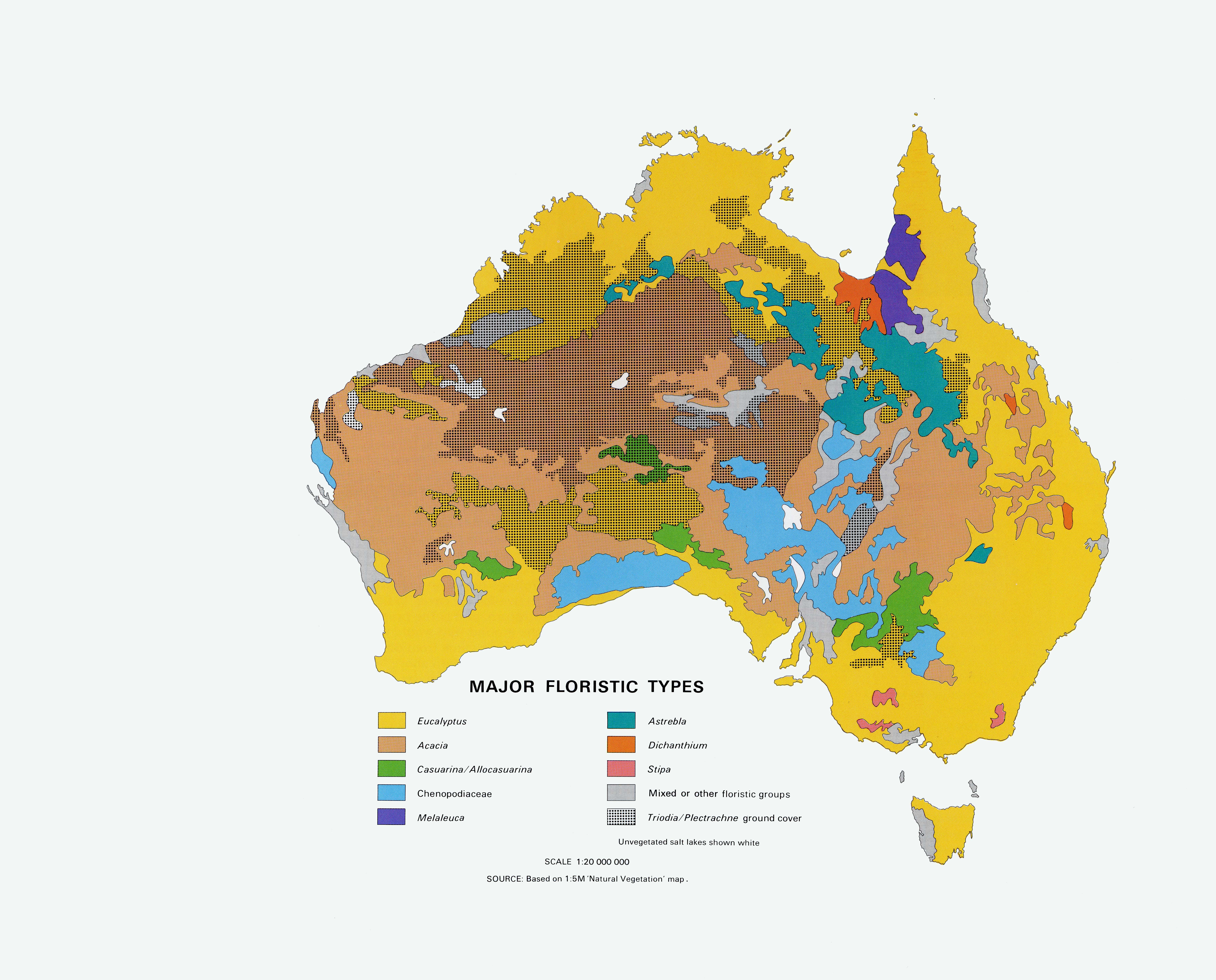
The third map of Australia is a simple map of vegetation types. Because the map is clear and of a well known part of the world the location information is limited, but it has all the important elements of a map – especially a Title, Legend, Scale and Production Documentation. This map is also placed to one side of the 'piece of paper' – this is to allow for the loss of paper when it is bound into a book. However, it could equally have been positioned like this because the map maker liked the 'look of it'.
Text
In general, all text (both on the face of the map and in the marginalia) should use the same font. The smallest font should be easily read (the simple 'rule of thumb' is that the smallest character should be no less that 0.8mm high). Occasionally for special effect or emphasis an elaborate font is used for the Title or for symbols – but this is not normally the case.
To assist with ease of reading, the number of font sizes which are used should be limited.
For example:
- Map Title (always the largest font) – e.g. 16pt
- Any text on the face of map – e.g. 10pt to 14pt
- Any text in the margin of the map – e.g. 10pt
- Footnotes (always the smallest font) – e.g. 8pt
Italics, bold and differently coloured fonts may (and should) be used to add emphasis or distinguish different features.
Over the years elaborate sets of rules have evolved regarding the selection and placement of text – particularly in relation to topographic maps. The Geoscience Australia Topographic Data and Map Specifications are an excellent place to start if you are seeking guidance on the text on maps – its section on Type Selection and Placement of its Section 2 – NTMS Specifications is particularly useful. (NTMS is the acronym for 'Australian National Topographic Map Series'.)
Symbols
If possible, it is best to use symbols which are well known – national standards and conventions should be adopted where applicable. These can also be adapted to suit the map’s needs. If special symbols are developed for a map they should be included in the map legend.
Developing a symbol usually means defining its colour, line weights and shape. This can be very complex or quite simple depending on the requirements of the map. In general, the simpler the symbol the more intuitive it becomes and the easier the map it is to read.
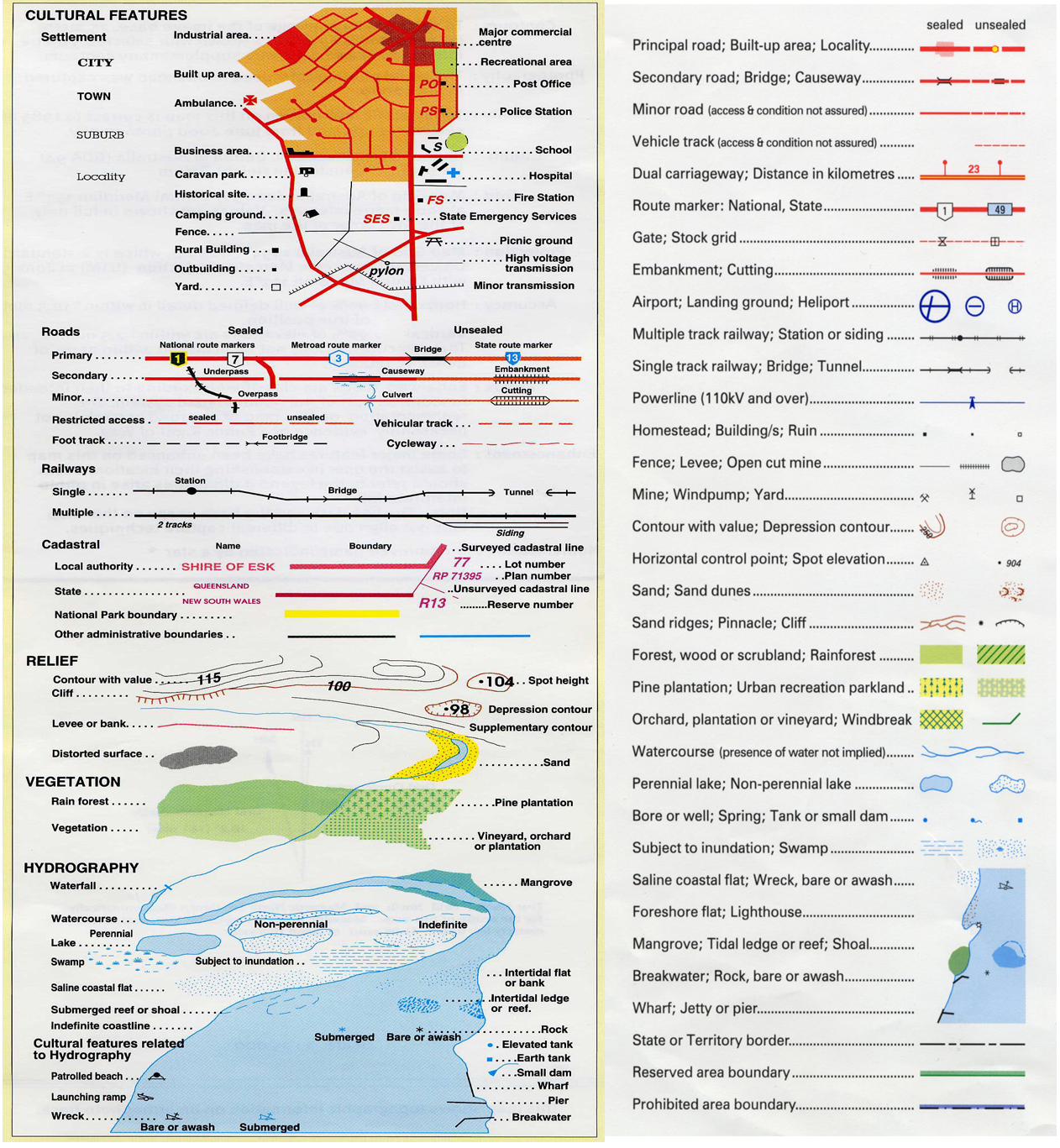
They show how similar, but not identical symbols have been used for the same feature. Rivers are blue; roads are red and vegetation is green.
But note some of the differences. For example; contours are brown on one and black on the other; while different types of railway lines are symbolised differently.
Getting a Little Technical about Symbols
Many map makers, especially those who are doing a 'one–off' map, don't worry too much when designing their symbols. They simply choose a colour and style out of the 'paint box' and use it.
However in series maps it is important that each individual map sheet looks the same. For these, rules need be developed about how a symbol is drawn and used – especially if a map is to be produced using computers. This is set of definitions is commonly called the maps symbology and they are usually included in the specifications for the map series.
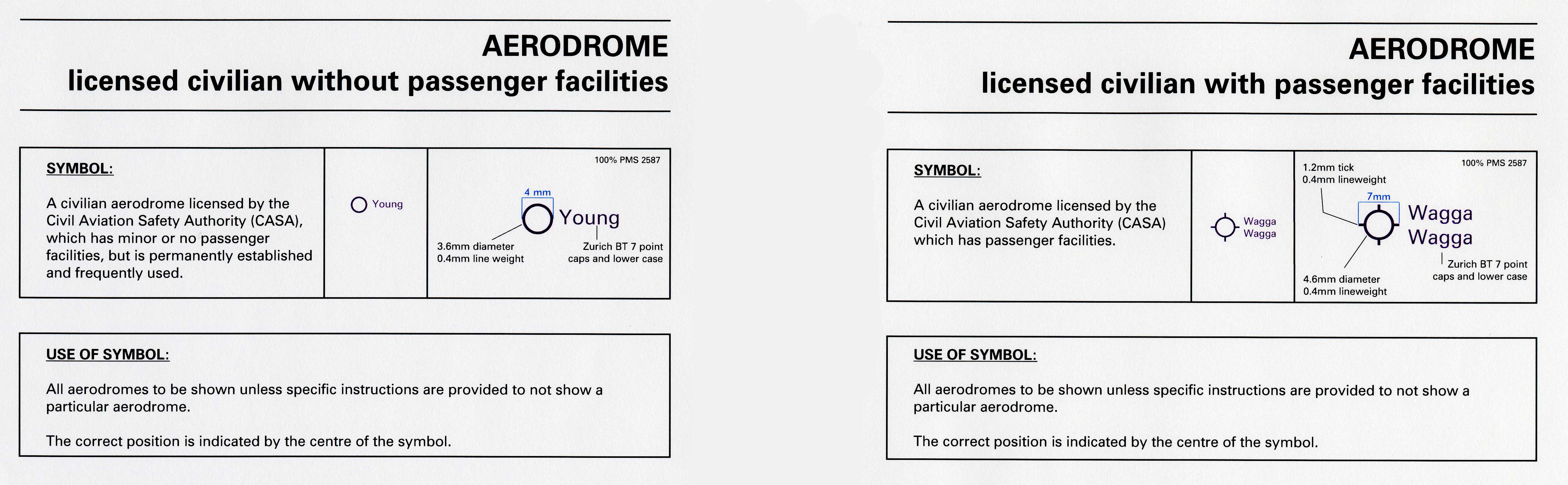
These are two examples of how a symbol can be designed.
The top box in both images is defining the symbol by:
- firstly defining what the symbol is identifying
- secondly giving an example of what the symbol looks like on the map
- thirdly by giving the defining:
> line widths, lengths and shapes
> the text’s font type (Zurich BT is a particular font)
> the text’s font size (7 points)
> the text’s font format (words start with a capital)
> colours that are to be used, such as a brand name of a particular colour.
The second box is defining when the symbol is to be used.
Colours And Patterns
Colour design is a science in itself but a few basic rules can help a map achieve its aims and still be nice to look at:
- A consistent set of colours should be used for symbols (e.g. roads in red, rivers in blue)
- Use tones/shades and different colours to differentiate and emphasise
- The colour selected, its intensity, and the size of the area will have a large bearing on the visual impact of the map. For example bright 'solid' (100% colour) yellow might be a good colour for a small area but a light yellow (say 15% of the solid colour) would often be a better option for a very large area
- Use colour and tonal variation to give 'light and shade' to the map, ie use the full spectrum of colours, and make some 'dark' and others 'light' so that the map doesn't look flat
- Avoid using patterns, especially ‘hachures’ (a series of parallel lines) as they can copy or print badly and may obscure important underlying detail. (Note: patterns are often necessary and suitable for thematic maps such as geological maps.)
Note: If your map is likely to be copied in a single colour (e.g. a black and white photocopy) then simple patterns should be used instead of subtle colour differences. As with colours, the pattern chosen as well as its density will determine the aesthetic impact of the map. Heavier patterns (such as closely spaced lines) will generally have more visual effect than an open dot for example. Variation, and above all moderation, is the key to successful patterning for a monochrome map.
Explaining Some Jargon – Symbols and Symbology
This is a distinction with can be very confusing to the uninitiated and the difference is very simple:
- A symbol is a shape which is defined — e.g. the shape of an anchor
- Symbology is the set of rules which relate to how that symbol is used — e.g.
- an anchor which is up–side down means a ship wreck
- a blue anchor means it is a safe place to moor a boat
- a red anchor means it is not a safe place to moor a boat etc.
Ownership And Logos
In most cases map makers wish to retain the ownership of their map (called copyright). This ownership can relate to the information shown on the map (often called the intellectual property) as well as the map itself. This is done by a statement which may include the copyright symbol (©) and possibly the displaying of an organisations logo or other official 'trademarks'.
As well as showing ownership, logos can also be used record sponsorship or responsibility for the information being mapped. It is important that map makers remember the following:
- logos cannot be used without formal approval
- there may be in–house rules as to how and where logos and trademarks are displayed
- avoid using excessive numbers of logos – these can overpower the map
While most maps have ownership statements attached to them, they may not have use restrictions. However, if a new map is made using an existing map as all or part of its source it is common for to require that the original map be identified.
- displaying the Australian Coat of Arms
- adding the words "© Commonwealth of Australia"
It may also list the uses and restrictions on the map.
Elevation
Many maps show elevation – especially topographic maps.
As explained in the Topographic Maps section, elevation is usually shown using contour lines. In simplistic terms, a contour line is a line which joins points of equal elevation. Where these lines are above sea level they are simply called contour lines and where they are below sea level they are called bathymetric contour lines.
One convention is that contour lines are generally shown as brown or black lines and bathymetric contour lines are shown as blue lines.
Another convention is that numbers are placed on a selection of the contour line to indicate their height above or below sea level. These are positioned with the top of the number pointing up the slope – so by looking at only one number you know which way is 'uphill' and which way is 'downhill'.
In the 1800's with the adoption of contours as the preferred method to show elevation, map makers experimented with ways to further enhance the maps. Two methods have become the modern standard:
- relief shading
- hypsometric tints
Explaining Some Jargon – Bathymetry and Hypsometry
Hypsometry is the measurement of the height of the land; the word is derived from a Greek word for height
Bathymetry is the measurement of the depth of underwater features; the word is derived from two Greek words which mean deep and measure
In simple terms one is about mapping the land above sea level and the other charting the land below sea level. The difference between a map and a chart is explained in the Section on Navigation Charts.
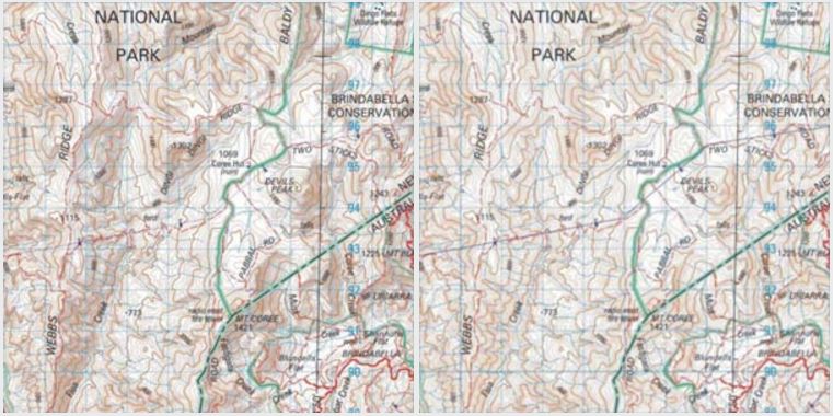
Relief Shading (or Hill Shading)
This technique was created to give a flat map a 3D visual impression. It is designed to simulate the effect of the shadow cast by relief features such as mountains, ranges and gorges. It is based on the convention that an imaginary light source (eg the Sun) is in the northwest corner of the map and the shadows spread out towards the southeast corner.
Originally this work was undertaken by highly skilled map makers, but today automated computer packages are able to achieve the same effect.
Hypsometric and Bathymetric Tints
This technique was also created to give a flat map a 3D visual impression. However it is much easier to produce than the relief shading technique and has become very popular for General Reference maps – especially for Atlases.
Over time a convention has emerged :
- soft colours are used for elevations/depths near sea level
- stronger colours are used for elevations/depths further away from sea level
- for the land these colours are ‘earth hues’ (browns) and for the sea these colours are ‘water hues’ (blues)
- in some parts of the world, where elevations are significantly higher than Australia’s, greys and white (perhaps to suggest snow) are often used for very high land (e.g. for peaks in the Himalayas)
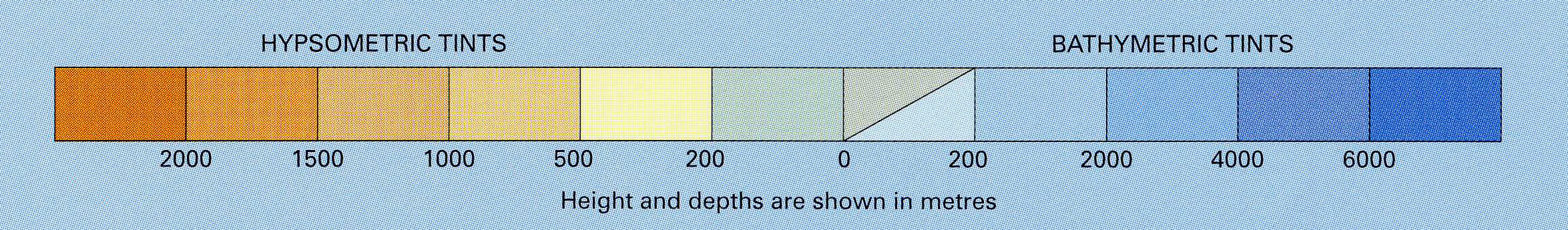
Secondly, note that for the 0–200 metres below sea level two colours are given – the top one is for height below sea level on the land (eg in Lake Eyre) and the bottom one is for depth below sea level in the sea.
Explaining Some Jargon – Enlargement And Inset
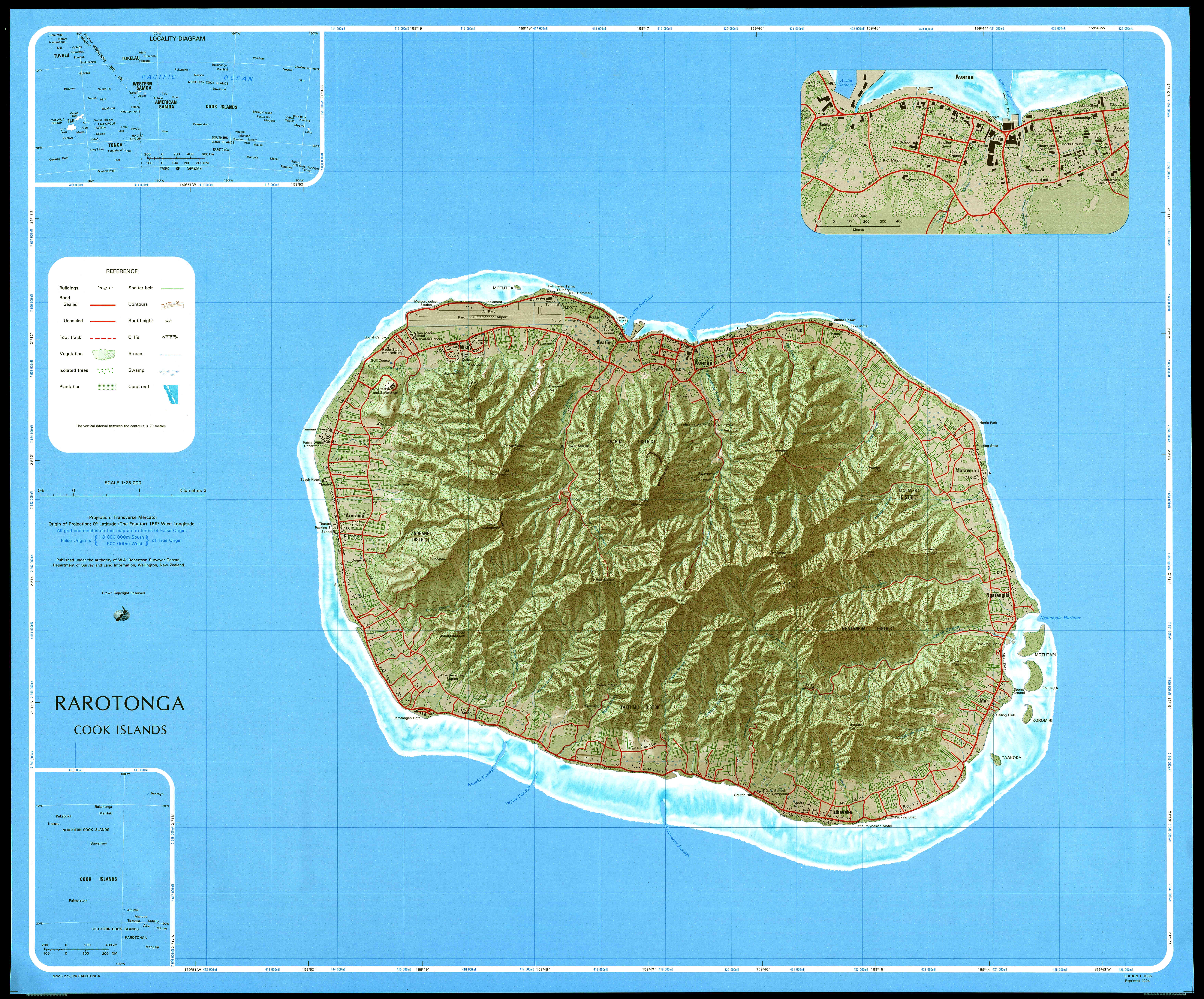
An inset is a small map which is included with the main map, but it is from a different area. These may be at the same or different scales to the main map.
In the case of the map of Rarotonga below – the maps in the north–west and south–west corners are inset and they are at a smaller scale than the main map. They are designed to show where Rarotonga is located relative to other islands and countries in its vicinity.
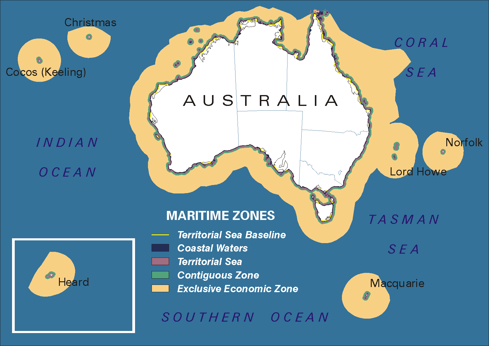
In the case of the Maritime Zones report map (below) the inset is at the same scale, but it is from an area outside the extent of the main map.
It is not uncommon for a map to be composed entirely of different scales insets and not have a main map. An excellent example of this is maps of scattered islands (as is found in the Pacific Ocean) – these are typically (but not exclusively) found it world atlases.
An enlargement is a specific type of inset – the difference is that an enlargement shows a part of the main map that is already being shown. These areas are usually more congested than the main map and are therefore shown a second time at a larger scale than the main map. This is done to supply greater detail of areas that have a great deal more to show than the bulk of the main map.
For example in the map of Rarotonga (above), the entire island is shown at one scale and the city of Avarua (which is also shown in the main body of the map) is shown in more detail by using an enlargement.
Further Reading
- pbc Geographic Information Services – Elements of Cartographic Style
- http://www.gismanual.com/style/
- University of Colorado – Cartographic Communication
- http://www.colorado.edu/geography/gcraft/notes/cartocom/cartocom_ftoc.html
- USA Geological Survey (USGS) – Topographic Map Symbols
- http://erg.usgs.gov/isb/pubs/booklets/symbols/
- Wikipedia – Cartographic Relief Depiction
- http://en.wikipedia.org/wiki/Hypsometric_tints#Hypsometric_tints
- Wikipedia – CMYK Color Model
- http://en.wikipedia.org/wiki/CMYK
- Wikipedia – RGB Color Model
- http://en.wikipedia.org/wiki/RGB